Did you know that the most powerful weapon you have on your WordPress site? the right answer is your call-to-action buttons because it’s the weapon that connects your visitors to your business deal or product purchase, and that’s why it does the most important job. When you are going to develop a new WordPress website and at that time you need to be aware of call-to-action—basically some people don’t care about buttons because they don’t know the value of buttons. See if you are going to approach WordPress website development service providers—you should definitely ask the details and questions related to the call-to-action.
But adding a “click here” button to your WordPress website isn’t enough—if you want to see results, you need to take some time and think about creating the right call-to-action. We give you 3 best ways to create an effective call to action for your WordPress site, so read carefully, every point is worth it.
1. Strategic Placement and Visibility
The placement of your CTAs is critical. Users should be able to find them quickly without having to search, which means they should be placed where users would naturally see them. Here are some strategies to ensure your CTAs are strategically placed and highly visible.
Above the Fold
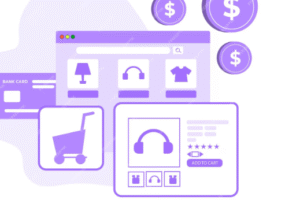
Place your primary CTA above the fold, the part of the web page visible without scrolling. This placement ensures that visitors see the CTA immediately upon landing on your site. For example, if you’re running an e-commerce site, a “Shop Now” button should be prominently displayed on the home page.
End of Blog Posts
Place your primary CTA above the fold, the part of the web page visible without scrolling. This placement ensures that visitors see the CTA immediately upon landing on your site. Going to see one example—if you’re running an e-commerce site, a “Shop Now” button should be prominently displayed on the home page.
In the Navigation Menu
By incorporating a CTA into your site’s navigation menu, users can easily find it as they explore different pages. Next we see one example—a “Get Quote” button in the menu will constantly remind users of the action they can take.
2. Compelling Design and Copy

A CTA must stand out visually and must have compelling copy to motivate users to act, only then they can reach you easily so don’t forget to do this. Read and learn on for some tips to ensure your CDAs are visually appealing and persuasive.
Use Contrasting Colors
Your CTA should be in a color that contrasts with the rest of your page, but fits into your overall color scheme so you can choose a color that appeals to you. This variation draws attention and makes the button stand out, by having a button unique, it looks different so there are more opportunities for customers to focus on it. Ok we will see one example then you can understand very easily, if your site’s primary colors are blue and white, a bright orange or green CTA button will catch the eye, so be careful when choosing a color.
Make it Big and Bold
You should know that the size of your CTA is important. It should be large enough to be noticed but not so large that it overwhelms the page and on a site it should be uniquely and specifically capable of touching customers. Then most importantly you should use bold fonts for CTA text to ensure readability and impact, customers should be easy to understand.
Clear and Action-Oriented Text
The text in your CTA should be concise and action-oriented and should be easy to understand and engaging for the viewer. First, we are going to see some examples—then you can easily understand “Buy Now,” “Connect with Us,” “Get a Free Guide” or “Start Free Trial.” Use those verbs that encourage immediate action. The main thing is that the sentence you use must match the content above. Actually users need to know what happens when they click the buttons and it should be linked to your store or any other information.
Incorporate Urgency and Value

Actually adding a sense of urgency can motivate users to act quickly. The content you use should be very attractive and unique like using catchy short words—if any discount is new on your service you should create content highlighting the announcement. Phrases like “limited time offer” or “only a few spots available” can create fear of missing out (FOMO) which is sure to attract visitors. Additionally, you should highlight the value or benefit users will receive. For example, “Get your free e-book now” emphasizes the value the user receives (the free e-book).
3. User-Friendly and Mobile-Optimized

Making sure your CTAs are user-friendly and mobile-friendly is very important and we’re going to tell you how to make sure your CTAs perform well on all devices.
Responsive Design
Make sure your CTA buttons are easy to click on mobile devices and check that they are clicked fast. They should be large enough to tap effortlessly and avoid accidental taps and it should be spaced well enough away from other clickable elements and ideally placed exactly where it need to be.
Simplify Forms
If your CTA leads to a form (eg, a signup or contact form), make sure the form is as short and direct as possible. On mobile devices—users are less likely to fill out long forms then you should ask only for essential information to reduce friction.
Sticky CTAs:
On mobile devices—sticky CTAs at the bottom of the screen as users scroll are most effective. This ensures that the CTA is always visible—making it easy for users to take action without having to scroll up again.
Loading Speed
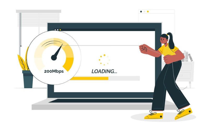
Be aware that page load speed can significantly affect the performance of your CTAs. Literally, visitors always prioritize time, and if your site is slow, users may leave before they see your CTA so compress images, optimize your browser cache then use a Content Delivery Network (CDN) to improve your site’s performance.
Conclusion
The final phase of the blog, we hope our blog will definitely help you learn more about the final stage of blogging, the call-to-action. Now you all know that it brings so many benefits and we are very excited to share the important things with you. Actually we provide unique WordPress web design services and we use the best CTA strategies and create unique buttons. If you don’t mind, take a look at our portfolio, which shows our strength in WordPress development.